
Draft:Vortex Configurator
Vortex Configurator is a companion application that lets you personalise the in-game overlay of Vortex Legends. With it you can fine-tune buff bars, on-screen information and visual aids to match your own playstyle — no advanced knowledge required.
Changes you make are saved automatically and apply in-game within about one second, so you do not need to restart the client to see them.
The app has a navigation bar on the left with the sections described below. Each section is explained in plain terms so anyone can use it.
Video guide
New to the Configurator? Watch the video walkthrough below.
▶ Watch the Vortex Configurator video guide on YouTube
Settings
The starting tab, for application and file options.
- INI File — the location of the configuration file the overlay uses. It is detected automatically; you only need the Browse… button if you ever want to point it somewhere else.
- Theme — switch the app between a Light and Dark appearance.
- Reset to Defaults — restores all settings (General and Status List) back to their original values. Use this if you want a clean slate.

General
Global overlay toggles and display preferences.
- Show FPS & Ping — displays a real-time FPS counter and network latency (ping) indicator on screen. It can be dragged to any position, which is remembered automatically.
- Minimized Textures — loads lighter-weight textures to reduce visual clutter and improve performance.
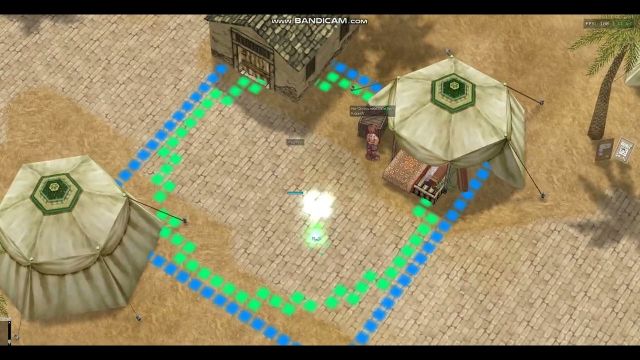
- Skill Warning — customises the cast indicator tiles (the warning tiles shown on the ground while a ground-targeted skill is being cast):
- Opacity — how transparent those tiles are (0 = invisible, 255 = fully solid; the client default is 150).
- Color — the default colour of the tiles. If the server sends a specific colour for a skill, that one takes priority.

LGP Overlay
Draws a coloured shape around your character to mark a radius — handy as a visual reference for chat range, attack range or any custom distance.
- LGP Enabled — master switch that turns the whole overlay on or off.
- Square — draws a square frame around your character:
- Show Square — toggle the square on its own.
- Square Range — distance from your character to the edge, in cells (1–14).
- Square Color and Opacity — colour and transparency (0–255).
- Circle — draws a circular ring around your character, with the same options:
- Show Circle, Circle Range (1–14 cells), Circle Color and Opacity.
The square and circle are independent — you can show one, the other, or both.

Skill Colors
Lets you place a coloured carpet on the ground where a skill lands, so you can spot area-of-effect skills faster (Storm Gust, Meteor Storm, Sanctuary, traps, and so on).
- Enabled — master switch for the whole feature.
- Max Active Carpets — limits how many carpets can be shown at once (the oldest disappears first when the limit is reached).
- Skill list — each row is one skill. Use the search box to find a skill by name or ID, and Add row to add a new one. For each skill you can set:
- W / H — the width and height of the carpet, in cells (1–19).
- Color and Alpha — the carpet colour and its transparency.
- Duration — how long the carpet stays on the ground.
- Shape — the texture used: None keeps the client default, or pick Square, Circle, Default or Aoes.

Status Timers
This group controls the buff bars shown above characters. It has two parts: Configuration (how the bars look and behave) and Status List (customising individual buffs).
Configuration
Layout and rendering options for the buff bars.
- Enabled — master switch; when off, no buff bars are drawn at all.
- Max Visible — how many bars are shown above your character (1–30). Extra buffs are collapsed into a "+N" indicator.
- Bar Width / Bar Height — the size of each bar.
- Bar Gap — the vertical space between bars (0 = touching).
- Above Head Margin — extra space above the head; increase it if bars overlap your character or name.
- Head Offset Override — leave at 0 for automatic positioning. Only change it if bars appear at your feet (try 55–65).
- Opacity — transparency of the bar fills (0–255).
- Show Labels — show each buff's short name to the left of its bar.
- Show Timer (Global) — show a countdown on every bar (individual buffs can override this in the Status List).
- Label Font Size — text size for labels and timers (0 = default).
- Label Outline — outline thickness around the text for readability.
- Show Party Buffs — also show buff bars above your party members.
- Party Max Visible — how many bars to show per party member.
- Defaults — the Default Color and Default Priority used for any buff you have not customised individually (lower priority = closer to the head).

Status List
Here you customise individual buffs/statuses one by one.
- Search — find a status by ID, name or alias.
- Filters — show All statuses, only the Configured ones, or the Hidden ones.
- For each status you can set:
- Color — its bar colour.
- Priority — its sort order (lower = closer to the head).
- Alias — a custom short name to display next to the bar.
- Hide — hide that specific buff from the bars.
About
Shows information about the application (version and credits).
